Why Some Neutral Paint Colours Look Amazing In One Home… And Terrible In Another
/
Neutral paint colours are often marketed as “safe,” “timeless,” and “works anywhere.” But if you’ve ever painted an entire room — or worse, an entire home — only to discover the colour suddenly looked completely different once it was on the walls, you already know the truth:
Neutral paint colours are not one-size-fits-all.
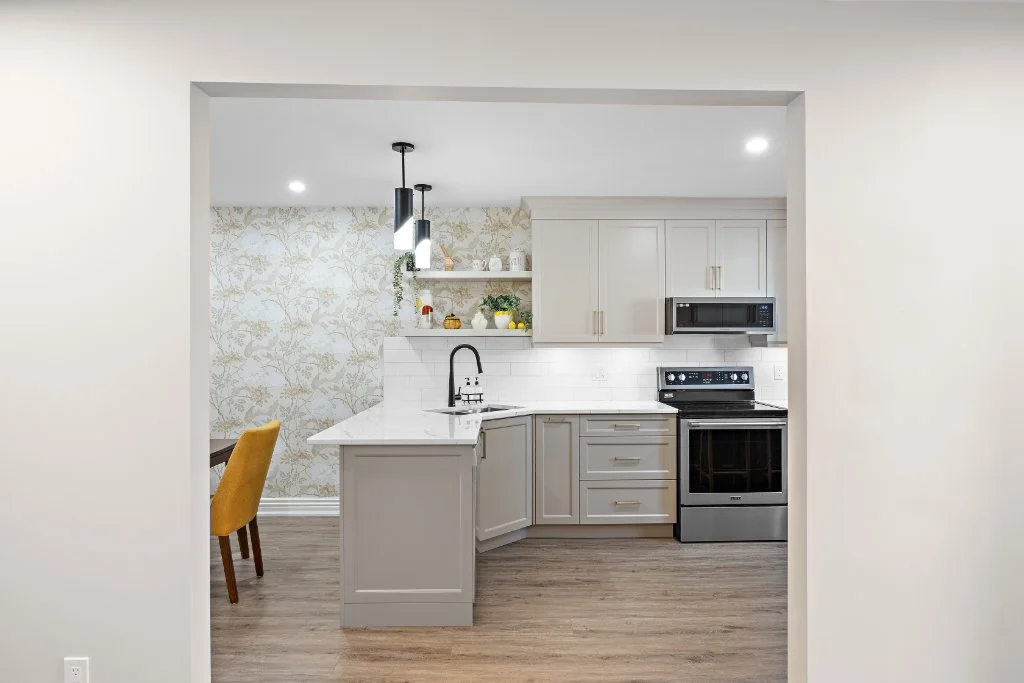
We recently met with a client who had her entire condo painted grey before moving in because the colour looked beautiful in the store and in online photos. Unfortunately, once the paint was on the walls, the condo’s north-facing windows pulled out cool blue undertones that made the whole space feel cold, flat, and unwelcoming.
The solution? Warmer neutrals.
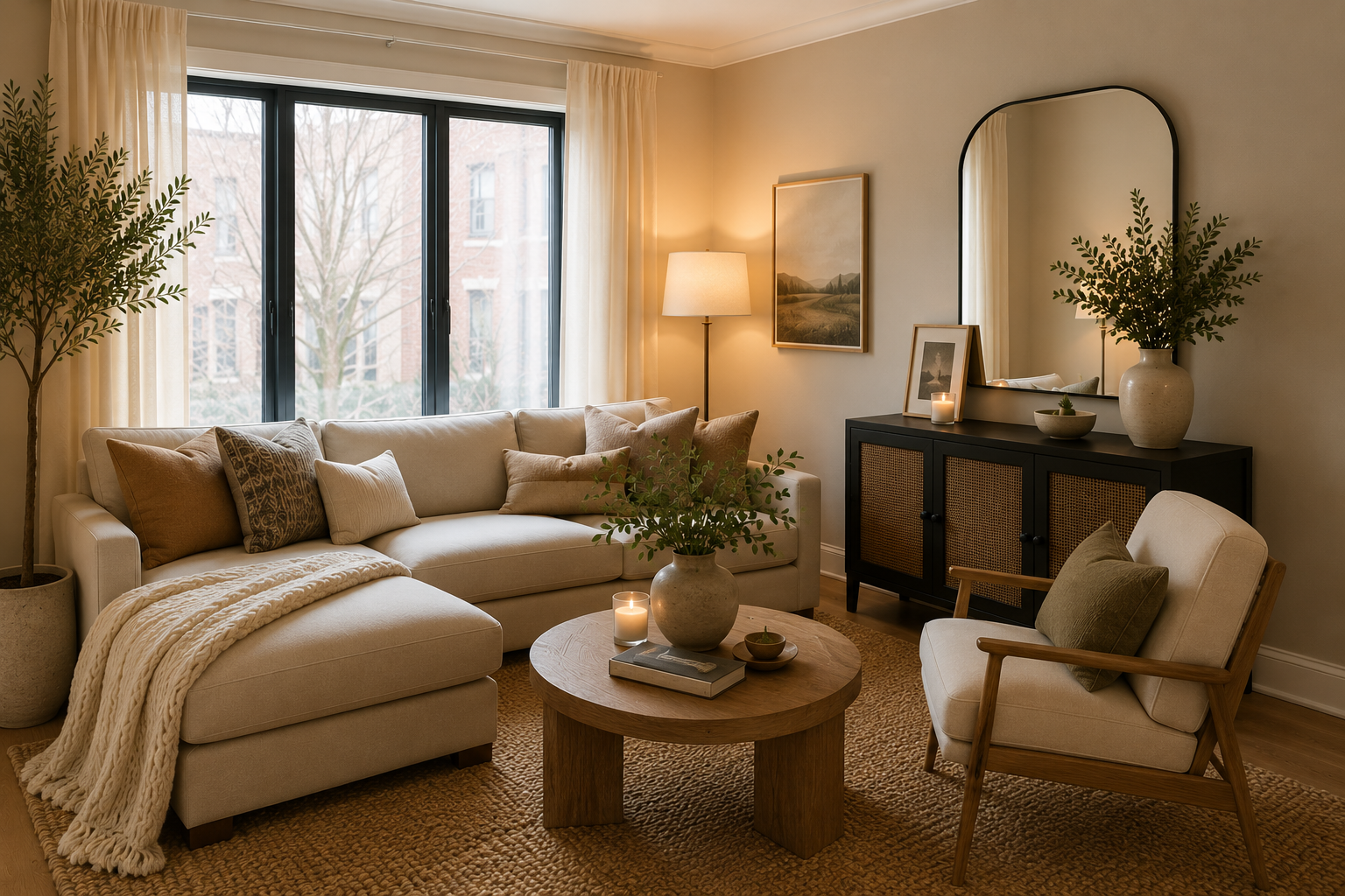
A softer Benjamin Moore beige instantly made the space feel brighter, warmer, and more comfortable.
And honestly, this happens all the time.
One of the biggest misconceptions homeowners have is believing that if a paint colour is popular, it will automatically work beautifully in their home. But lighting, flooring, cabinetry, ceiling height, trim colour, furnishings, and even the direction your windows face can dramatically change how a paint colour appears.
That’s why today we’re sharing some of our favourite neutral paint colours — and more importantly, where they actually work best.
Why Neutral Paint Colours Don’t Always Look Neutral
Paint colours are heavily influenced by undertones and natural light.
At the paint store, a colour may look soft beige, warm white, or light greige. But once it’s inside your home, hidden undertones can suddenly become much more noticeable.
A “neutral grey” may suddenly look:
blue
purple
green
icy
or overly cold
Meanwhile, a warm beige might suddenly look:
yellow
peachy
muddy
or creamier than expected
This is why two homeowners can use the exact same paint colour and end up with completely different results.
A few of the biggest factors that affect paint colours include:
Natural Light
Natural light changes throughout the day and affects every paint colour differently.
North-facing rooms tend to pull cooler blue-grey tones, while south-facing rooms usually bring out warmth.
Flooring
Warm hardwood flooring can make a neutral paint colour appear warmer. Grey flooring can pull cooler undertones from the walls.
Cabinetry & Countertops
White cabinets, cream cabinets, quartz countertops, backsplashes, and even black hardware can influence how paint colours are perceived.
Existing Décor
Furniture, artwork, area rugs, and fabrics all contribute to how colours feel within a space.
This is why choosing paint based solely on a tiny paint chip or an Instagram photo can sometimes lead to disappointment.
North-Facing Rooms Need Warmer Neutrals
North-facing rooms are one of the biggest trouble spots when choosing neutral paint colours.
Because northern light tends to be cooler and slightly blue-grey, it can make already-cool neutrals feel cold and sterile.
This is especially common in:
condos
apartments
basement spaces
shaded rooms
homes with limited natural light
If you’re working with a north-facing room, warmer neutrals are often the safer and more welcoming choice.
Some of our favourite warm neutrals for cooler spaces include:
Benjamin Moore Muslin
This is a beautiful soft beige that feels warm and comfortable without looking outdated or overly yellow.
It works especially well in:
north-facing condos
living rooms
hallways
open concept spaces
homes where you want warmth without going dark
Muslin is one of those colours that quietly makes a room feel more inviting.
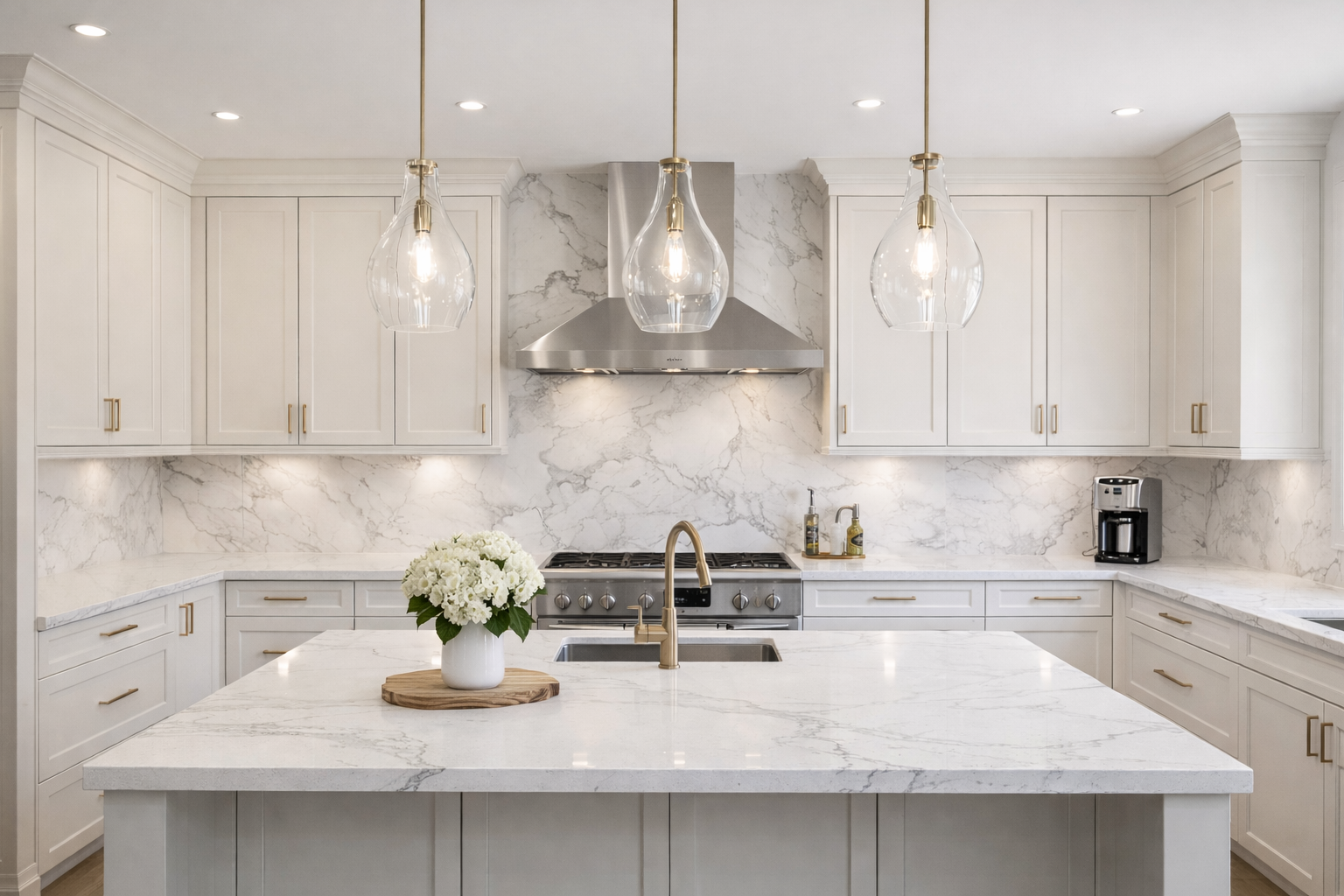
Benjamin Moore Ballet White
Ballet White has become incredibly popular for a reason. It’s a warm off-white with subtle greige undertones that feels soft and elegant.
It works beautifully in:
open concept homes
kitchens
living rooms
homes with warmer flooring
spaces where bright white feels too stark
Sherwin Williams White Duck
White Duck is another excellent option when homeowners want warmth without committing to beige.
It’s soft, cozy, and works particularly well in homes that have:
black windows
wood accents
warm flooring
transitional décor styles
South-Facing Rooms Can Handle Cooler Neutrals
South-facing rooms receive warmer sunlight throughout much of the day, which means they can often support cooler paint colours more successfully.
This is where some greys and cooler greiges can still work beautifully without feeling icy.
In these brighter spaces, cooler neutrals can help balance all the warmth coming into the room.

Some homeowners are surprised to discover that the same grey paint that looked terrible in a north-facing room suddenly looks beautiful in a sun-filled south-facing room.
That’s why there’s no such thing as a universally perfect neutral.
There’s only the right neutral for your specific home.
Choosing the right paint colour can feel surprisingly overwhelming once lighting, undertones, flooring, and cabinetry all come into play. If you’re planning to repaint your home and would like professional guidance — or a quote for interior painting — we’d be happy to help you create a space that feels warm, cohesive, and truly suited to your home.
Some neutral paint colours that often work beautifully in south-facing rooms include:
Benjamin Moore Classic Gray
A soft light greige that can sometimes look washed out in cooler rooms but feels balanced and airy in warm natural light.
Best for:
bright living rooms
kitchens
open concept spaces
homes with lots of sunlight
Sherwin Williams Agreeable Gray
One of the most popular greiges for a reason. In south-facing rooms, the warmer sunlight helps keep it soft and balanced rather than cold.
Best for:
family rooms
hallways
modern transitional homes
whole-home palettes
Benjamin Moore Pale Oak
A warm greige that shifts beautifully throughout the day and feels soft without becoming overly beige.
Best for:
bedrooms
open concept homes
spaces where you want warmth and brightness together

Beige Is Making A Huge Comeback
For years, grey dominated interior design.
Entire homes were painted cool grey. Grey flooring became trendy. Grey cabinetry exploded in popularity.
But lately, we’ve seen a major shift back toward warmer, softer neutrals.
And honestly? Many homes feel more comfortable because of it.
Today’s beige isn’t the heavy golden beige from decades ago. Modern warm neutrals are softer, more sophisticated, and much more balanced.
We’re seeing homeowners gravitate toward:
warm whites
taupes
greiges
creamy off-whites
earthy neutrals
mushroom tones
soft beiges
These colours tend to create homes that feel:
calmer
brighter
more welcoming
less sterile
and easier to decorate
Warm neutrals also tend to pair beautifully with:
natural wood
quartz countertops
matte black fixtures
brass accents
white shaker cabinetry
and layered textures
Our Favourite Neutral Paint Colours — And Where They Work Best
Here are a few neutral paint colours we consistently find ourselves recommending.
Benjamin Moore Winds Breath
A soft greige that feels warm without looking beige.
Best for:
modern homes
open concept layouts
kitchens
homes with lots of natural light
transitional spaces
Sherwin Williams Shoji White
One of the most versatile warm neutrals available right now.
Best for:
north-facing rooms
whole-home colour palettes
homes with black accents
warm modern interiors
cozy spaces
Sherwin Williams Aesthetic White
Despite the name, this isn’t a true white.
It’s a warm greige that shifts beautifully depending on lighting conditions.
Best for:
living rooms
hallways
homes with mixed lighting
spaces where you want warmth without obvious beige undertones
Benjamin Moore Muslin
Still one of our favourite choices when a home feels cold or lacks warmth.
Best for:
condos
north-facing rooms
traditional homes
cozy interiors
spaces that need softness
Why We Always Recommend Testing Paint Samples First
This may be the most important advice in this entire blog:
Never choose a paint colour from a tiny paint chip alone.

Paint stores have bright overhead lighting that looks completely different from the lighting inside your home.
A colour that looks perfect in the store may look entirely different:
in morning light
on cloudy days
at sunset
beside your flooring
beside your cabinets
or under warm LED lighting
We always recommend:
testing large paint samples on multiple walls
viewing them at different times of day
checking them beside flooring and cabinetry
living with them for a few days before committing
This small extra step can save homeowners from expensive repainting mistakes.
Should You Paint Every Room The Same Colour?
This is another question we hear often.
And the answer depends entirely on the home.
Using one neutral throughout the entire home can absolutely create a calm, cohesive look. However, that doesn’t mean every room will react to that colour the same way.
A neutral that looks beautiful in a bright south-facing kitchen may suddenly feel dull in a darker hallway or cool bedroom.
Sometimes we recommend:
slight shifts in tone from room to room
different sheens
warmer variations for darker spaces
brighter whites for rooms with less natural light
The goal isn’t simply to choose a trendy colour.
The goal is to create a home that feels good to live in.
The Right Neutral Paint Colour Should Feel Effortless
The best neutral paint colours are the ones you stop noticing because the room simply feels comfortable, welcoming, and balanced.
That’s the magic of a well-chosen neutral.
It quietly supports everything else in the space:
your furniture
your lighting
your décor
your cabinetry
and the overall feeling of your home
And while paint may seem like a simple decision, choosing the wrong colour can completely change how a room feels.
At Multi-Trade Building Services, we often help homeowners coordinate paint colours alongside renovations, cabinetry, flooring, tile, lighting, and finishes so the entire space works together cohesively.
Because creating a beautiful home isn’t just about following trends.
It’s about choosing colours and finishes that work beautifully in your home.
Thinking about updating your home with fresh paint?
Whether you’re repainting a single room, refreshing your entire home, or coordinating paint colours as part of a renovation, Multi-Trade Building Services can help. From colour guidance to professional interior painting services, we’ll help you create a home that feels warm, welcoming, and beautifully pulled together.
Contact us today to discuss your painting project and let’s make your renovation dreams a reality.

Looking for more renovation and interior design inspiration? Explore some of our other blogs below for expert tips, renovation advice, and ideas to help you love your home even more.