
Best Paint Colours for Dark Rooms That Don’t Get Much Natural Light
/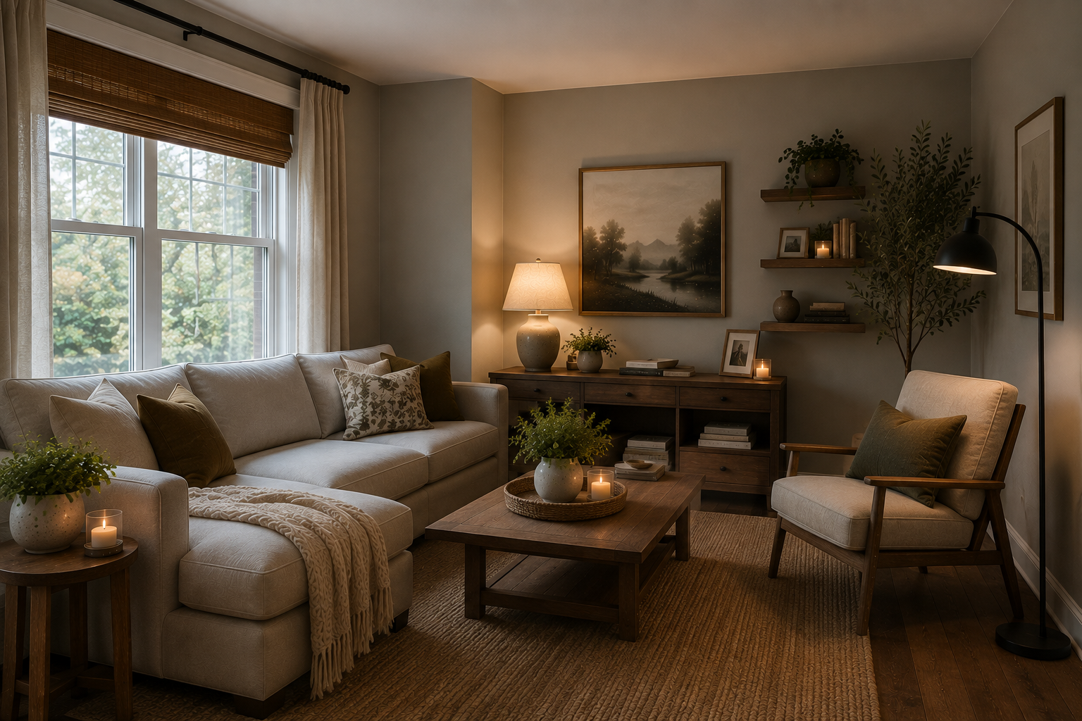
You know that room in your house.
The one where you walk in at 2:00 in the afternoon and still feel like turning on a lamp.
Maybe it's north-facing. Maybe there's one tiny window. Maybe there's a beautiful big tree outside that you love dearly but that also happens to block approximately 97% of the sunlight. Or maybe it's a basement, hallway, powder room or older family room that simply wasn't blessed with great natural light.
Whatever the reason, choosing a paint colour for a dark room can be surprisingly difficult.
And this is usually where someone says, "I'll just paint it white. That will brighten it up."
Maybe.
But maybe not.
So grab your coffee, and let's talk about what actually works.
What Is the Best Paint Colour for a Dark Room?
Here's the first thing I want you to know:
A dark room doesn't necessarily need the lightest paint colour you can find.
That sounds backwards, doesn't it?
Paint cannot manufacture sunlight. If a room receives very little natural light, brilliant white paint isn't going to suddenly make sunshine pour through the windows.
In fact, some bright whites can look surprisingly cold, grey or flat in a dark room because they don't have enough light bouncing around to bring them to life.
Instead, we generally want to look for colours that either:
reflect the available light well,
have enough warmth to compensate for cool or limited light,
or deliberately embrace the room's darker character.
That last one is important because sometimes the best answer isn't trying desperately to make a dark room look bright.
Sometimes it's making it look beautifully cozy instead.
Before You Pick a Colour, Ask a Different Question
Before we start talking about whites, greiges, warm neutrals and LRV, I want you to forget about paint for a minute.
Instead, ask yourself this:
How do I want to feel when I walk into this room?
Because I think we sometimes get so caught up in asking, "How do I make a dark room look brighter?" that we assume brighter is automatically the goal.
It isn't.
Maybe you want the room to feel light and airy. In that case, absolutely — let's start looking at warm whites, creams and light neutrals.
But maybe you want it to feel cozy.
Or peaceful.
Or cheerful.
Maybe you want warmth. Maybe you want drama. Maybe you've spent twenty years surrounded by beige and you're finally ready for some colour.
In that case, the best paint colour for your dark room might not be white, beige or greige at all.
My Own Dark Office Was the Inspiration for This Article
Actually, this entire article was partly inspired by a room in my own home.
After my mom passed away, we began making plans to eventually move into her house. When I started deciding how the different rooms would be used, the room that made the most sense for my office happened to be my very first childhood bedroom.
There was something rather special about coming full circle and turning that little bedroom into the place where I would now run my business.
When I was a child, it was purple.
And not just any purple.
We're talking Donny Osmond purple.
I can't say I was particularly offended by the purple all these years later, but I decided it was probably time for the room to enter a new chapter.
The bigger problem was the light.
When I was growing up, that bedroom received plenty of natural light. But forty-some years is a long time, and during those decades the trees in our backyard neighbour's property grew.
And grew.
And grew.
Today, those enormous mature trees block most of the natural light that once came into that room.
The bright childhood bedroom I remembered had become a surprisingly dark and sometimes gloomy little room.
And yet it was still the perfect location for my office.
So I had a decision to make.
I Didn't Want to Make My Office Look White and Bright
Here's where my decision was probably different from what conventional paint advice would have told me to do.
I had absolutely zero interest in painting that room white.
I didn't want grey.
I didn't want beige.
I didn't want greige.
I'd spent years using beautiful neutrals throughout my homes, and there is absolutely nothing wrong with them. But when I began choosing colours for this house, I wanted something different.
I wanted colour.
Not screaming-at-you-from-across-the-room colour. I wasn't trying to recreate my Donny Osmond bedroom.
But I wanted my home to have personality.
And more importantly, I knew how I wanted my office to feel.
I wanted it to feel warm.
Friendly.
Inviting.
Cozy.
Safe.
I wanted to walk into that room in the morning and smile. I wanted it to feel like somewhere I could comfortably sit for several hours working — because that's exactly what I would be doing there.
Once I figured that out, trying to find the "best white paint for a dark room" became completely irrelevant.
White wasn't the answer to my question because I was asking the wrong question.
Sometimes the Answer Is to Stop Fighting the Darkness
I eventually chose Sherwin-Williams Rose Colored SW 6303, a beautiful muted rosy colour, which in that room actually looks closer to a beachy coral.
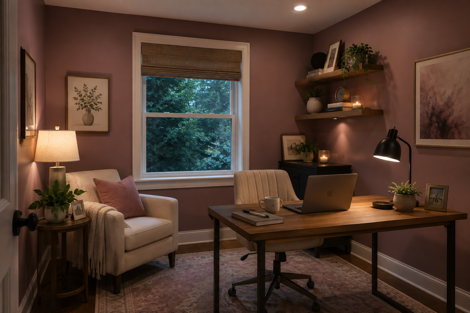
And that's an important distinction.
Choosing colour for a dark room doesn't mean you have to choose something incredibly bright or highly saturated.
A muted rose, dusty blue, soft sage green, earthy terracotta or warm mauve can bring tremendous personality into a low-light room without overwhelming it.
Instead of trying to make my office appear to have natural light that simply wasn't there, I decided to work with the room I actually had.
That's something I encourage homeowners to consider.
You don't always have to fix a dark room. Sometimes you can embrace it.
So How Do You Know Whether to Choose White, Greige or an Actual Colour?
Start with the feeling — not the paint chip.
If your answer is:
"I want this room to feel as light and airy as possible."
Start exploring warm whites, creams and very light neutrals.
If it's:
"I want something neutral, but I don't want white."
Look at light greiges, warm beiges and soft taupes that coordinate with the rest of your home.
But if your answer is:
"I want this room to feel cozy and welcoming."
"I want it to have personality."
"I want something cheerful."
"I want to walk in here and feel happy."
Then please give yourself permission to look at actual colour.
Maybe it's a dusty rose.
Maybe it's sage green.
Maybe it's a muted blue.
Maybe it's a soft clay or terracotta.
Maybe it's a warm yellow.
And yes, maybe it's a gorgeous dark green or navy.
There isn't a chart I can give you that says dark north-facing room = Paint Colour X.
I wish there were. It would make choosing paint considerably easier.
Colour is much more personal than that.
Why I Can't Tell You the Perfect Colour for Your Room
I can give you some wonderful colours to sample.
But I can't responsibly tell you that your dark room should be sage green or dusty rose without ever seeing your house.
What's on the floor?
What colour is your trim?
What rooms can you see from this one?
What colour is your sofa?
Are your kitchen cabinets warm or cool?
Is there brick or stone in the room?
What colours have you already used throughout your home?
And perhaps most importantly:
What colours make you happy?
Your dark room doesn't exist in isolation.
The right colour needs to work with the rest of your home and with you.
That's why I would rather give you the tools to make a good decision than hand you a list of ten supposedly "perfect" colours and pretend one of them will magically work.
Don't Automatically Try to Make a Dark Room Something It Isn't
If you take nothing else away from this section, remember this:
Decide what you want your room to feel like before you decide what colour you think a dark room is supposed to be.
If you genuinely want light, bright and airy, wonderful. We'll talk about some beautiful whites and neutrals next.
But if what you really want is warmth, personality, comfort or colour, don't talk yourself out of it because your room doesn't receive much sunlight.
Sometimes the most successful room isn't the one where we disguise its limitations.
It's the one where we stop fighting them and turn them into part of what makes the room special.

First, Let's Talk About LRV
If you've spent any time researching paint colours, you've probably come across the letters LRV.
LRV stands for Light Reflectance Value.
Basically, it tells us how much light a paint colour reflects. The scale runs from 0 to 100. Dark colours have lower LRVs, while whites and pale colours have higher ones.
But don't get too hung up on finding the paint colour with the highest possible number.
LRV is useful information, but it's only one part of choosing a colour.
A warmer colour with a slightly lower LRV may actually feel more inviting in your particular room than a very high-LRV white with cool undertones.
Think of LRV as one clue — not the final answer.
Warm Whites Are Often Better Than Stark Whites
If you want your dark room to feel brighter and you love white walls, I would usually start with a warm white rather than a stark, icy white.
Some colours worth sampling include:
Benjamin Moore White Dove OC-17
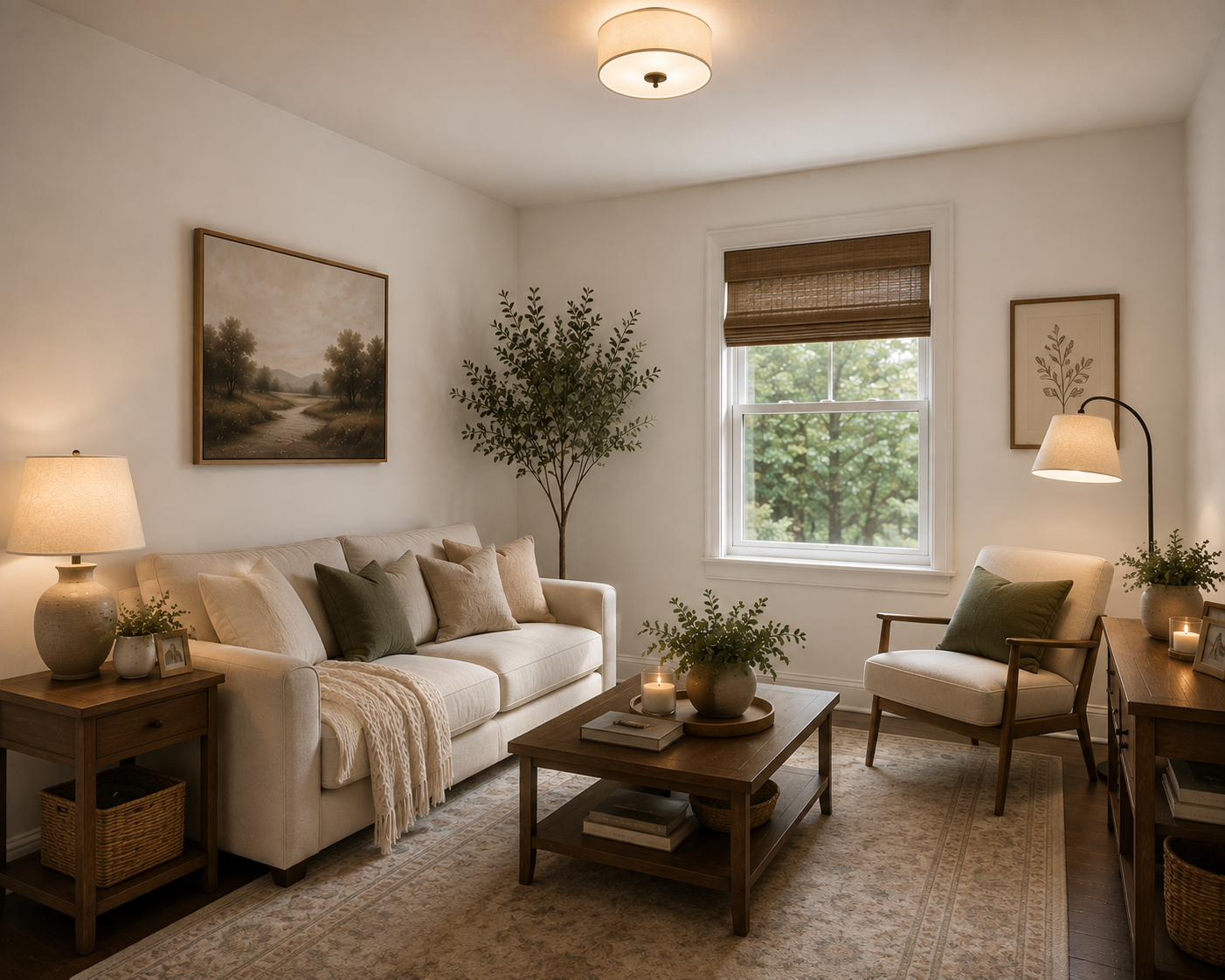
White Dove is popular for good reason. It's a soft, warm off-white that can brighten a space without giving you that cold, almost clinical feeling that some whites develop in low light.
It also works particularly well when your home already contains warmer finishes such as wood floors, beige, cream, warm stone or traditional furnishings.
Benjamin Moore Swiss Coffee OC-45
Swiss Coffee is another beautiful option for a darker room.
It has considerably more warmth than a crisp white, which can help compensate for a lack of warm natural sunlight. It's especially lovely if you're trying to create a comfortable, welcoming room rather than a stark contemporary one.
Benjamin Moore Simply White OC-117
Simply White is another one I would put on the sample list. It has warmth to it but still reads as a fairly fresh white.
If the rest of your house has light, warm colours and you want the darker room to transition naturally into those spaces, Simply White can be a great candidate.
Sherwin-Williams Alabaster SW 7008
Alabaster is one of my favourite types of whites for a low-light space because it isn't trying too hard to be WHITE.
It has subtle beige warmth, which gives it a softer appearance. Instead of fighting the lack of sunlight, it tends to work with it.
Sherwin-Williams Pure White SW 7005
Despite its name, Pure White isn't an aggressively stark white. It has just enough softness to make it versatile.
If Alabaster feels a little too creamy for the rest of your home's colour palette, Pure White may give you a cleaner look while still avoiding that blue-white effect.
Not Sure Which Colour Will Work in Your Home?
Choosing paint can get overwhelming surprisingly quickly — especially when the colour you love on a tiny paint chip looks completely different once it's on your wall. If you're planning a renovation and would like some guidance pulling your colours, finishes and overall space together, we'd be happy to help.
Contact Multi-Trade Building Services to talk about your renovation.
What If I Don't Want White?
Good!
Because you absolutely don't have to paint every dark room white.
Some of the nicest choices for rooms without much natural light are soft greiges, warm beiges and gentle colours.
Benjamin Moore Pale Oak OC-20
Pale Oak is a lovely light neutral when you want more substance than an off-white.
It's somewhere in that wonderful greige family — not really grey, not really beige — and its softness can make a darker room feel comfortable without making it feel heavy.
Benjamin Moore Edgecomb Gray HC-173
Despite the word "gray" in the name, Edgecomb Gray has considerable warmth.
It's a great colour to sample if your home already has warm neutrals and you want continuity from one room to another.
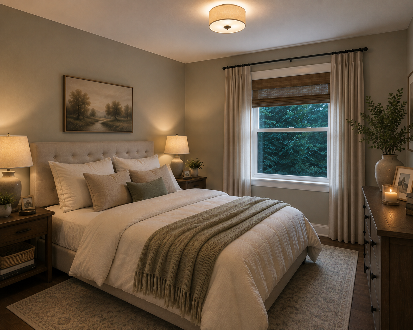
Benjamin Moore Revere Pewter HC-172
Revere Pewter is deeper than Pale Oak or many off-whites, so I wouldn't automatically put it in every very dark room.
But if you're not necessarily trying to make the room look white and bright and instead want it to feel warm, sophisticated and cozy, it can work beautifully.
Sherwin-Williams Accessible Beige SW 7036
Please don't let the word beige scare you.
We're not necessarily going back to the yellow-beige houses of twenty years ago.
Accessible Beige has grey undertones that temper its warmth, giving you a soft greige rather than a heavy traditional beige. It can be especially useful when your flooring, furniture or surrounding rooms have warmer tones.
Sherwin-Williams Drift of Mist SW 9166
If you're looking for something lighter, Drift of Mist is another one I'd sample.
Sherwin-Williams specifically recommends warmer neutrals for north-facing rooms because northern light tends to be cooler. A colour with some warmth can help counteract that cool cast.
What Colours Make a Dark Room Look Brighter?
This is one of the most common questions homeowners Google, and the answer isn't simply "white."
Generally, colours that can help a dark room feel brighter include:
warm whites
creams
pale greiges
warm light beiges
soft peachy neutrals
very pale yellows
some light, muted greens
Interestingly, yellow can work extremely well in rooms without natural light because it naturally gives us a feeling of sunshine and warmth.
But I'm talking about a soft, sophisticated yellow, not necessarily a screaming lemon-yellow kitchen from 1992.
The goal is to introduce warmth without making the walls announce themselves from the driveway.
What About Grey Paint in a Dark Room?
Be careful.
For years, grey became the default answer to practically every paint question.
Kitchen? Grey.
Bathroom? Grey.
Bedroom? Grey.
Garage? I'm surprised we weren't painting the lawn grey.
The problem is that cool grey paint in a room without much natural light can become considerably cooler and gloomier than it looked on the paint chip.
A lovely soft grey in the paint store may suddenly look blue, dingy or almost purple once it's on the walls of your north-facing family room.
That doesn't mean you can't use grey.
It means I would lean toward warmer greiges rather than cool blue-greys, particularly if your goal is to make the room feel warmer and brighter.
Should You Ever Paint a Dark Room a Dark Colour?
Absolutely.
And this is where things get interesting.
If you have a small den, office, powder room or TV room that receives virtually no natural light, sometimes trying to convince it that it's a bright sunny room is a losing battle.
So don't.
Embrace it.
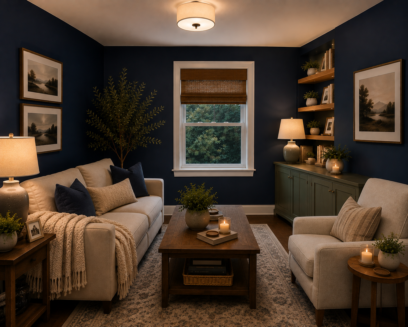
A rich navy, deep green, charcoal or warm dramatic colour can make a naturally dark room feel intentional and luxurious.
Benjamin Moore Hale Navy HC-154, for example, can create a gorgeous cozy room when paired with warm lamps, lighter upholstery, wood and perhaps brass or warm metallic accents.
This approach works particularly well when the room's purpose suits coziness — think TV rooms, libraries, offices and bedrooms.
There's a big difference between a room that looks dark and dreary and one that looks dark and dramatic.
The difference is intention.
Don't Choose a Paint Colour Without Looking at the Rest of Your House
This is one of the biggest mistakes I see homeowners make.
They choose each room independently.
They love Colour A, so they use it in the living room.
Then they find Colour B on Pinterest and put that in the hallway.
Six months later they discover Colour C on Instagram and paint the dining room.
Individually, they're all nice colours.
Together?
Your house starts looking a little like a paint store exploded.
Your rooms don't have to be the same colour, but they should talk to each other.
If your main living areas have warm undertones, suddenly introducing a very cool grey into the adjoining dark room may make both colours look wrong.
Instead, look for a common thread.
Maybe your kitchen is a warm off-white. Your hallway could be a soft greige. Your darker family room might then move one step deeper into a warm taupe.
Different colours.
Same family.
That's what creates flow.
Pay Attention to Your Fixed Finishes Too
Before falling in love with a paint colour, look at the things you're not changing.
Your flooring.
Kitchen cabinets.
Countertops.
Tile.
Fireplace.
Large furniture pieces.
Trim.
These finishes already have undertones, whether you realize it or not.
For example, if you have warm honey-toned hardwood floors, a very cool blue-grey wall colour can make the floor look even more orange.
Neither product is necessarily ugly.
They just aren't doing each other any favours.
Paint should connect the room's existing finishes rather than fight with them.
Why You Should Never Choose Paint From a Tiny Chip
Here's another coffee-table confession.
Those tiny paint chips are useful for narrowing down your options.
They are terrible for making the final decision.
A two-inch square cannot show you what an entire room will look like.
And the lighting in the paint store is not the lighting in your house.
Once you've narrowed your choices down to two, three or maybe four colours, sample them in the actual room.
And don't just paint one tiny square on one wall.
Use large sample boards or peel-and-stick samples that you can move around the room.
Why?
Because the exact same paint colour can look different on four different walls.
Look at Your Paint in the Morning, Afternoon AND Evening
This is probably the most important part of this entire article.
Please don't choose your paint colour at 10:00 Saturday morning and tell the painter to start Monday.
Give yourself a day or two with those samples.
Look at them:
First thing in the morning.
How does the colour look when the room is receiving whatever natural light it gets?
At noon.
Does it become warmer? Cooler? Washed out?
Late afternoon.
Has the colour suddenly picked up an undertone you didn't notice earlier?
After sunset.
Now turn on the lamps and overhead fixtures you actually use every evening.
You may be shocked at how different the colour looks.
And because you probably spend a significant amount of time in your house after dark, how the paint looks under artificial light matters every bit as much as how it looks at noon.
Your Light Bulbs Affect Paint Colour Too
Yes, I'm giving you one more thing to think about.
Your light bulbs.
Warm bulbs can make paint colours look creamier, warmer and sometimes slightly more yellow.
Cooler bulbs can emphasize blue or grey undertones.
So when you're testing paint, test it with the actual lighting you're planning to use in the finished room.
Don't choose your wall colour under one type of bulb and then replace all your fixtures with a completely different colour temperature afterward.
You may wonder who came into your house overnight and changed your paint.
What Is the Best Paint Finish for a Dark Room?
People sometimes assume that using very shiny paint will bounce more light around and solve the problem.
Technically, higher-sheen paint does reflect more light, but that doesn't mean you want glossy living room walls.
For most walls, an eggshell or matte finish is still a good choice depending on the room and the paint product you're using.
Remember that sheen also emphasizes imperfections. If you're dealing with older plaster or drywall that's seen better days, increasing the sheen can make every bump and patch more noticeable.
Instead of relying on shiny walls, improve the room's overall lighting.
Add lamps.
Layer your lighting.
Use mirrors strategically.
Choose lighter window treatments.
And make sure your bulbs provide enough usable light.
Paint is powerful, but it doesn't have to do all the work.
So, What's the Safest Paint Colour for a Dark Room?
If you're standing in the paint store right now desperately Googling this while holding seventeen colour chips, here's where I would start.
For warm whites, sample Benjamin Moore White Dove OC-17, Benjamin Moore Swiss Coffee OC-45 and Sherwin-Williams Alabaster SW 7008.
For soft neutrals, try Benjamin Moore Pale Oak OC-20, Benjamin Moore Edgecomb Gray HC-173, Sherwin-Williams Accessible Beige SW 7036 or Sherwin-Williams Drift of Mist SW 9166.
But — and this is the important part — don't choose one simply because someone on the internet told you it's the "perfect paint colour."
There is no universally perfect paint colour.
The perfect colour is the one that works with your flooring, your furniture, your adjoining rooms, your windows, your light fixtures and the way you want the room to feel.
One Final Piece of Advice
When you're trying to brighten a dark room, don't become so focused on making it "light" that you forget to make it a room you actually love.
Sometimes a soft creamy white is exactly what that room needs.
Sometimes it's a warm greige.
Sometimes it's a pale muted colour.
And sometimes the room is practically begging you to stop fighting with it, paint it a gorgeous deep navy and turn it into the coziest room in the house.
So bring home the samples.
Move them around.
Look at them while you're having your morning coffee. Look again at lunchtime. Check them at 5:00. Then turn the lights on that evening and look one more time.
And most importantly, look beyond that one room.
The best paint colour shouldn't just make your dark room look better.
It should make sense as part of your whole home.
Because when the colours flow naturally from one space to another, you don't walk into a room and think, That's a great paint colour.
You simply walk in and think:
I really like this room.
And that's exactly what we're after.
Ready to Transform a Room in Your Home?
The right paint colour can completely change how a room feels — but sometimes paint is just the beginning.
If you're thinking about updating a room, renovating a space or finally tackling a project you've been putting off, Multi-Trade Building Services can help you bring it all together. From the initial ideas and colour choices through to the renovation itself, our team can help create a space that works beautifully for your home and the way you live.
Ready to get started? Contact us today to talk about your project and request a quote.

Good design isn't just about how a room looks — it's about how it makes you feel when you walk into it. Here are a few of our favourite tips for choosing colours and creating spaces that feel right at home.










Choosing paint for a dark room isn't as simple as reaching for white. Learn how lighting, undertones, the colours throughout your home — and most importantly, how you want the room to feel — can help you choose the perfect paint colour.