The Ultimate Guide to Selecting the Right Paint Colour
/You've decided it's time to freshen up your home and get some painting done. Now all you have to do is pick just the right paint colour. Easy, right? With the thousands of colours that are available, it's not as easy as just picking a colour you like the look of. In this post, we'll explain many of the things you need to know to help you make the right decision when it comes to paint colour.
Prefer to listen?
What Is a Wallcovering?

Sometimes we want to freshen up our walls, but not always with paint. A wallcovering isn't just paint or wallpaper. There are also wood panels, fabric wallcoverings, and even upholstered walls. Anything that can be used to cover a wall is a wallcovering. However, most often, we are 'covering' our walls, ceilings, trim, and doors in paint.
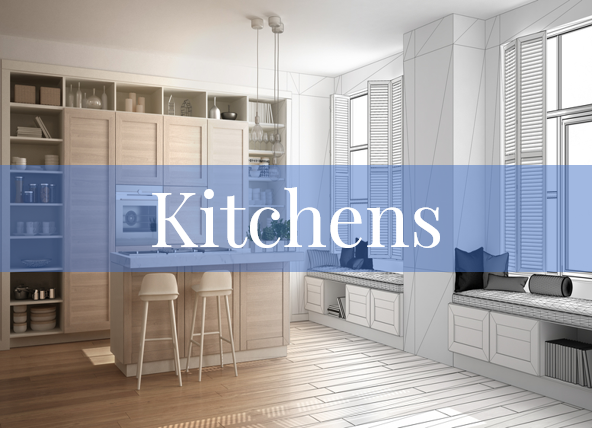
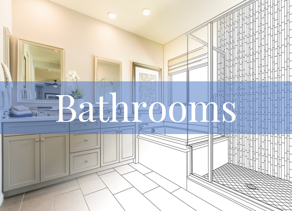
Paint is one of the fastest and easiest ways to change the appearance of a room. It can be used on walls, woodwork, and ceilings in any room. Its ease of maintenance and low cost are other advantages.
Paint Finishes
Not only do you need to select a paint colour, but you also have to select a paint finish. You can select from gloss, semigloss, satin, eggshell, and flat. The higher the gloss, the more imperfections will be visible.
If you live in a home that has a lot of imperfections in the walls and you don't want to have them skimmed smooth, it's best to use a flat or eggshell finish. As long as you select high-quality paint, you will still be able to wash or even scrub your walls with a flat or eggshell finish.
I'm not suggesting that you shouldn't use gloss or semigloss paint. There are times when it can work magic on a room as it will add dimension. A glossy finish can lighten up a dark hue with its reflective quality. Just make sure that it's being applied to a smooth, clean surface.
A flat or eggshell paint finish provides a warmer and pleasingly softer-looking wall. These walls will be smoother-looking and more light-absorbing, which will truly allow the wall to be more of a backdrop showcase for the room's furnishings and décor. A gloss or semigloss paint will be more light-reflecting and will sometimes look harder and draw attention to itself.
Textured Paint
If you have an older house, particularly one with lathe and plaster walls, you may have issues with cracks in your walls or ceilings. You can opt to have the drywall repaired, but sometimes in older homes, cracks will still reappear regardless. Textured paint is an option under these circumstances, as it is a thicker paint and sometimes contains sand-like granules. It will also give a distinctive and dramatic appearance to walls.
It's applied thickly, and while it's wet on the wall, various textures can be created in it using a brush, comb, or other patterning device. Repainting over textured walls does take longer than painting over plain walls, and more paint is needed to paint over textured walls.

Selecting Paint Colours
Colour really does make the room. Select the right colour, and you can visually enlarge a small space, bring in more light, or deliver a kick of energy.
Intensity
It's not just the colour of the paint you want to consider; it's also the intensity. Intensity is the degree of brightness in a colour. A nice, bright yellow on a paint chip will look cheerful, and you might think it's a great colour for your child's bedroom or craft room. However, it can 'shout' when it's placed on all four walls. This is because the light bouncing from one bright wall to the other intensifies the effect of the yellow.

Now, I'm not saying that you should never select an intense colour such as a bright pink or a dark navy. However, just remember that a colour will appear much darker on the wall than it did in the small sample you chose. This is also where the sheen of the paint makes a difference. A dull finish softens the colour, whereas a shiny or glossy sheen will reflect light and make the colour seem even brighter.
What Is LRV, and Why Is It Important?
Think about the effect you want to create in a room. Do you want to make the most of the natural and artificial light in a room? Do you want to soften the sky glare that sometimes enters through the large glass window? This is where the Light Reflectance Value (LRV) will help.
LRV refers to how light or dark a paint colour will look on a scale of 0 (black) to 100 (white). The higher the LRV number, the lighter the colour. The lower the LRV number, the darker the colour. And... dark colours absorb light while light ones reflect it.
The one thing you have to remember is that if your room is dark due to a lack of natural or artificial light, a light paint colour with a high LRV will not save the room. Yes, a light paint colour will make the room look brighter than a dark colour, but what you really need is better lighting in the room. Improving the lighting in a room will really bring any paint colour to life.
So what does all of this mean? All paint colours are assigned an LRV, and paint colours with a lower LRV will reflect some but not a lot of light. A paint colour with a higher LRV will reflect a lot more light. Generally, an LRV of 50 and higher is where you will really notice light reflecting back into the room. The closer you get to 100, the more light the colour will reflect.
Testing Paint Colour Samples

The light under which a paint sample is seen, the size of the colour sample, and the colours next to it all influence the appearance of a paint sample. To view it properly, the paint sample should be brought to the room where it's intended to be used. Look at it at all times of the day and night, in natural light and artificial light.
As interior decorators and contractors, we are fortunate to have access to larger paint samples (8"x10" samples) that our customers can access. Instead of looking at the small chips you get at the paint store, our customers can look at a much larger sample, which provides a more realistic test.
No matter the size of your sample, place it against the flooring, next to the major pieces of furniture that will be in the room, and against curtains or other colourful items in the room. Then, hold the paint samples flat against the wall. Try it on different walls and in the corners. The colour will look slightly different in different places because of the varying angles at which light hits it.
When I guide my clients in selecting their paint colours, I always recommend that they take a piece of white paper with them when they are looking at the paint chips in the various locations. The existing wall colour, for example, will influence the way a colour looks. By placing a sheet of white paper behind the chip, you will get a truer impression of what the colour will look like on the wall. However, remember that white is the 'brightest' colour and will reflect intensely. This may fool you into believing that a small colour sample is less bright than it really is.
Also consider what time of day the room is most often used. If a paint colour looks great at night but not so much during the day, think about when the room is most often used. If it's the bedroom, how it looks during the day won't matter as much as how it looks at night.
Many neutral colours have a chameleon-like quality. They will shift in colour with changing light. I had one client who was selecting a stain colour for his kitchen cabinets. The colour looked olive green at night and taupe during the day. He actually really liked the contrast and selected that stain colour for that very reason. However, someone else may actually get put off by the change in appearance over the day.

7 Tips to Help You Select Your Paint Colour
There isn't a one-size-fits-all formula for selecting a paint colour. I could tell you my favourite shades, but depending on the style of your home, what type of light it gets, and the colour and texture of your furniture, it's possible that not a single one of my favourites will look any good in your home. A consultation with an interior decorator is the way to go if you feel completely unsure of your selection.
Below are some of my tips that will help you select paint colours for your home. Let me know in the comments if you used any of my tips or the information in this post for your home. Let me know what your favourite tip is.

If you've got a lot going on in the room you are painting, you can unify the space by using several shades of one hue. A monochromatic scheme will help bring everything together in a room. For example, use a pale blue on the walls, such as Benjamin Moore Exhale, paint the bookcases in a darker blue, such as Lucerne, and maybe the trim or door in Soot.
Don't shy away from an all-white room. Using a palette of white, cream, and off-white creates a calm, airy backdrop and will highlight the furnishings. It will also make the space feel bigger and brighter.
Neutrals don't have to be just grey and beige. Slate, clay, sand, and ochre are colours of the earth and will keep you grounded. Combine neutrals in the same family. Look for the undertones and select neutrals that are all warm or all cool.
Consider deep colours in rooms that you use occasionally. This is a great opportunity to experiment and go bold. Violet, onyx, sapphire, and ruby are all confident colours that will create character and dominate a room. Consider Benjamin Moore's Chambourd in a library or powder room.
Bright midday sun will wash out most pale hues. If you love a pale colour like Ballerina Pink or French Lilac, use it in a room that has softer, indirect illumination.
If you have a relatively open-concept home, you can use different colours to define different spaces and highlight interesting architecture. I'm not suggesting you have blue in the living room and green in the kitchen. That will make even an open concept look fragmented and disjointed. Keep things harmonious by combining shades of the same colour.
Trim doesn't have to be white! I love pairing a neutral or light-coloured wall with a dark trim. Be really bold and select black for the trim to really showcase some architecture or unique trim, such as crown molding or wainscoting.

One last tip to share: these are three of my favourite Benjamin Moore colour combinations:
For something bold and interesting: Purple Lotus as the main colour, with Stuart Gold and Witching Hour as accents
For something neutral: Porcelain as the main colour and Filtered Sunlight and Appalachian Brown as accents
For a gorgeous blue: Windmill Wings as the main colour and Chelsea Gray and Simply White as the accents.