5 Best White Paint Colours for Your Home
/
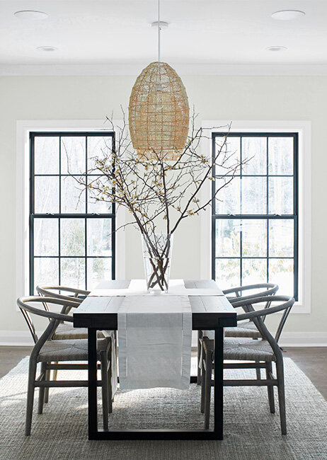
Cloud White
Have you ever stood in a paint store with the intention of picking up some white paint? You thought that task was going to be easy, didn't you?! When you started looking at your options for white, you were probably overwhelmed at how much selection there was. It's absolutely incredible how many different shades of white paint there are.
White is a great option for homes, and not just for the ceiling and trim. We're going to explore shades of white and let you know how to pick the right one for your home. We'll share our favourite white paint colours as well.
Why Choose White?
The white colour scheme has been a popular choice amongst interior designers and architects for decades. It is known for its versatility and cleanliness.
The different shades of white can be used to create a calm, sophisticated, or cozy atmosphere. Some people also believe that the cooler shades of white are more relaxing and can help you sleep better.
Benjamin Moore Paper White OC-55
White, no matter the shade or hue, creates a clean, crisp, and bright look. White paint is also a great backdrop for your furniture, and you can always pair it with other colours to create a unique look.
White is also the perfect choice for light-filled spaces, as it enhances the quality of the natural light in the room.
White is so versatile, and there are so many different shades available that you could decorate a room entirely in white and it would still be a showpiece of different colours!
What About Those Undertones?
Very few whites have little or no undertones. Undertones are those hints of other colours that you see when you look at a paint. Essentially, it is the underlying colour that is mixed with the main dominant colour.
Most whites have undertones of yellow, purple, grey, green, blue, and so on. Each white will look different when facing natural light, artificial light, or flooring, and will definitely look different against other colours and even textures of furniture. You may pick the perfect white for your living room now, but years down the road, when you get a new sofa, that white may look terrible!
One design tip we'll start out with is to narrow down your choice of white to either a warm white or a cool white based on which way your room faces. For a north-facing room, select a warm white to balance out the cool light. For a south-facing room, cooler white will counteract the yellowness of the bright sun. If your room is neither north nor south-facing, you can always fall back on a neutral white.
So How Can You Tell What the Undertones Are?
This is something that just comes with practice, but one method you can try is to take a paint chip and place it against a pure white sheet of printer paper. In most cases, you will quickly see how different the paint chip looks compared to the pure white paper. It will become obvious whether it looks yellowish (warm), bluish (cool), or similar to the paper and therefore has few undertones and is neutral.
5 Necessary Pieces of Advice Before We Get Started

Benjamin Moore Seashell OC 120
It's always exciting to pick your paint colours, but there are some 'rules' to follow to ensure we do it right.
First, don't just buy your paint colour from a paint chip in the store. More importantly, don't buy your paint colour by merely looking at a picture in a magazine or on your computer. The colours will look very different in your home and in the lighting in and around it.
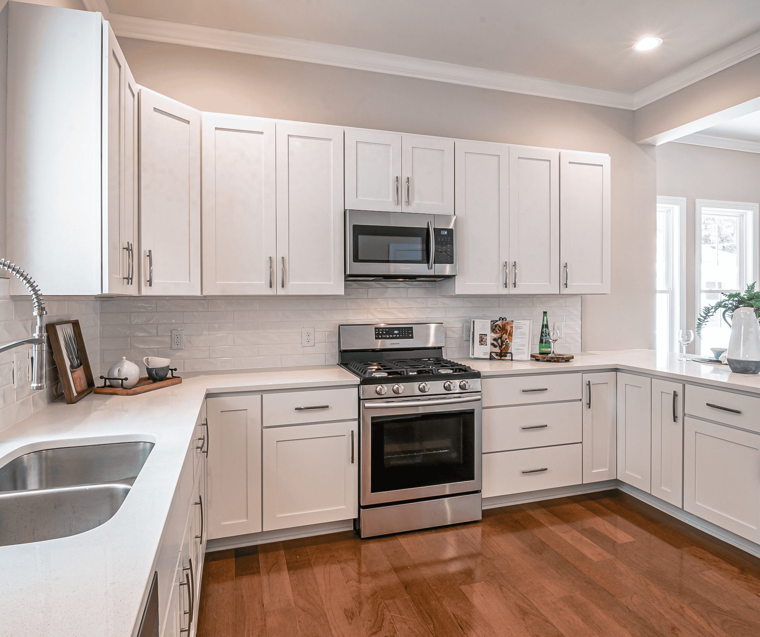
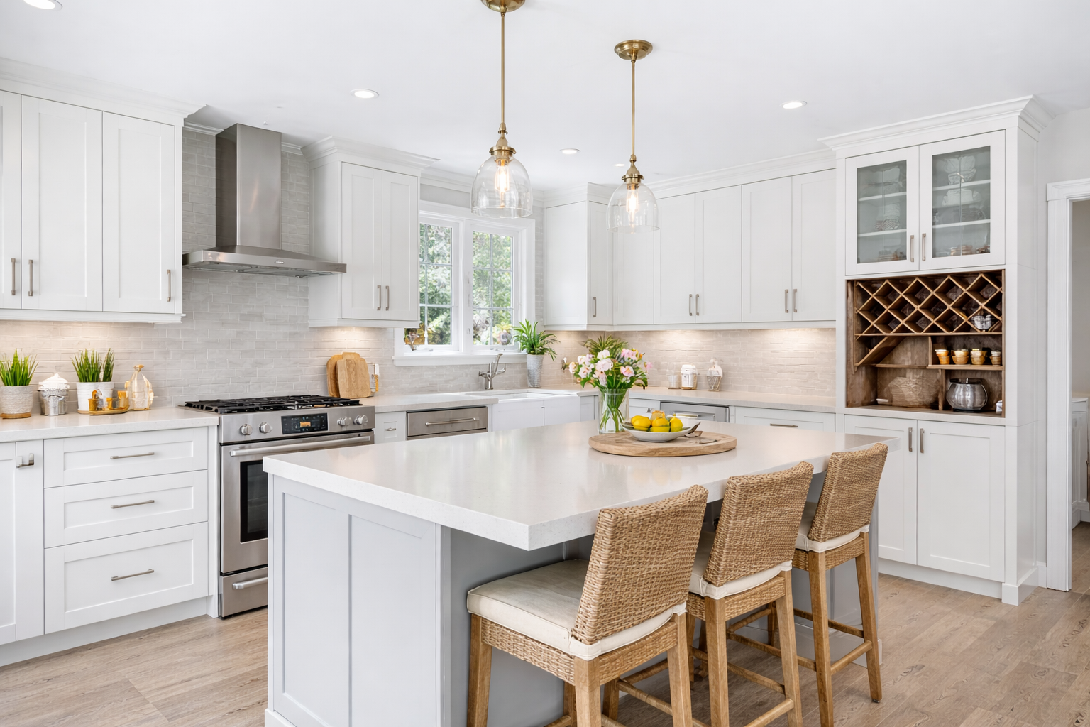
Second, don't pick your paint colour until you've got the other elements in your room selected and, if possible, installed. That means you should pick your kitchen cabinet colours, countertop, flooring, and backsplash before you pick your kitchen wall paint colour. Buy your furniture, artwork, window treatments, area rugs, and flooring for the living room before you select the paint colour.
Third, narrow down your paint colour selection to no more than 3 or 4. It will get overwhelming otherwise.
Fourth, get paint samples. I don't mean those little chips from the paint store. Those are okay to narrow down your selection to 3 or 4 of your favourites. I'm talking about actual cans of sample paint.
You need to test the paint colour with actual paint. Brush or roll the paint right onto your walls, and be sure to brush on two full coats of paint. That's the way it's going to look when it's done, so be sure you're sampling the paint the same way.
A much easier way is to order full 12"x12" actual paint samples from Samplize. These samples were made with two coats of real paint, so they are colour-correct. They are peel and stick, so you can just peel them, stick them on your wall, and then peel them off to move to another wall or tuck them away when you want to consider that paint colour again in the future. The Samplize non-damaging adhesive backing allows for viewing in multiple locations and in different lighting without marking up your walls!
This is such a brilliant product! No messy paint cans and brushes to deal with!
The samples are sent right to your door, so it's super convenient. Samplize has samples available for Sherwin Williams, Benjamin Moore, PPG, and Farrow and Ball.
Fifth, before you make your final selection, make sure you look at the paint samples on your wall in the morning, noon, late afternoon, and evening. Look at them under natural light, artificial light, on sunny days, and on rainy days. Move them around to different walls to make sure you like the colour in the entire room.

What About the Sheen?
Okay, so now you've picked out the paint colour, but what about the sheen?
Sheen is the quality of things that are shiny, usually with reflected light. My general rule of thumb is to select a sheen that's less shiny; I'm not a fan of gloss, semi-gloss, or even satin, for that matter. Those belong on furniture. The lower the sheen, the fewer imperfections you'll see.
Flat sheen is the most stylish and is preferred by most decorators. Matte is also a great option and has a touch more sheen than flat, so it's a good compromise if you want a touch of sheen.
Many people prefer an eggshell finish on their walls because it's easier to clean. However, if you go with a higher quality of paint, you will be able to wipe and, in some cases, even scrub the walls with a flat finish. Check out the Regal Select Line at Benjamin Moore or the Duration Line at Sherwin Williams.
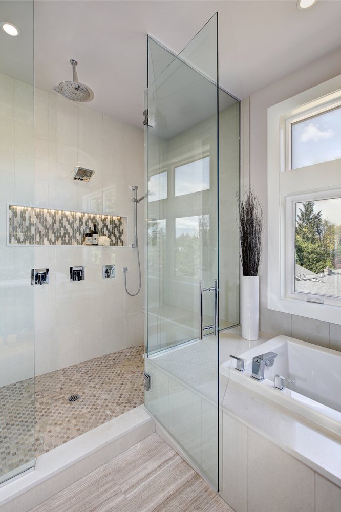
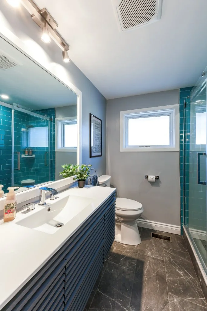
For kitchens and bathrooms, Benjamin Moore has a great Kitchen and Bath line of paint that holds up extremely well in moist environments.
Let's Get to Our Favourite Whites
There are over 900 different shades of white, so although we're going to talk about our favourite five, please don't feel like these are the only ones. These may not resonate well with your lighting or furniture. We also almost exclusively deal with Benjamin Moore and Sherwin Williams, but there are tons of other paint manufacturers that have great whites as well.
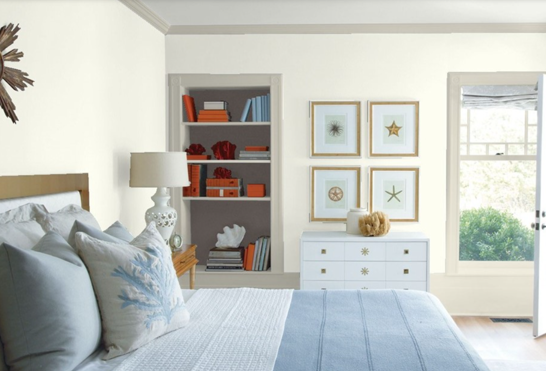
Cloud White

Cloud White
How can we not include this overwhelmingly popular designer favourite?! It is my favourite go-to white when I'm looking for a warm white. It goes with almost everything and really lets the texture of the furniture be the star.
Cloud White (CC 40 by Benjamin Moore) is perfect for ceilings and trim because it's warm and soft on the eyes. Consequently, it's not a sharp contrast with other colours in the room.
Because it has a stronger yellow undertone than other whites, Cloud White also works well on walls and cabinetry. It creates a natural and warm tone.
Chantilly Lace

Chantilly Lace
I can't think about this colour without singing a few lines of The Big Bopper's hit, 'Chantilly Lace'! It just instills a sense of joy, fun, and innocence. That's what Benjamin Moore's Chantilly Lace (OC 65) is all about! It's pretty close to pure white without undertones.
What is wonderful about this colour is that it creates a bright white space without appearing cold and clinical. Although it has slight blue and grey undertones, it creates a warm and welcoming feel. When my clients want a pure white, this is the one I always recommend first.
If you are looking for an even purer white, consider Highly Reflective White by Sherwin Williams (SW 7757). It is probably one of the purest whites around. It is so white that, when placed against a white countertop, it can make the countertop look like cream.
Extra White
Extra White
Extra White (SW 7006) by Sherwin Williams is another favourite of mine because it has the palest hint of grey as an undertone. So many of our clients are opting for grey colour schemes in their bathrooms, kitchens, and even bedrooms. This colour really allows other colours in the room to take centre stage and provides a crisp background for artwork and furniture.
Swiss Coffee

Swiss Coffee
This Benjamin Moore favourite (OC 45) has slight touches of yellow and green undertones. This is a great colour that works well with modern, traditional, country cottages, and everything in between.
I love pairing this colour with earth tones such as browns and terra cotta. However, this creamy paint colour also looks great with dark colours like charcoal grey or navy blue.
Pure White

Pure White
This Sherwin Williams colour (SW 7005) is a very versatile and flexible white. Although it is a soft white, it doesn't look creamy like some other warm whites do. This white easily picks up colour from its surroundings, which means that in a room where the elements are cool colours, it will look crisp and clean. In a room with warmer-toned furniture, flooring, etc., Pure White will look warmer and softer.
We hope this article has helped you gain some insight into picking your next paint colour. If you used any of the paint colours we've suggested here, we'd love to hear about it in the comments below.
OR
Let us know what your favourite whites are!